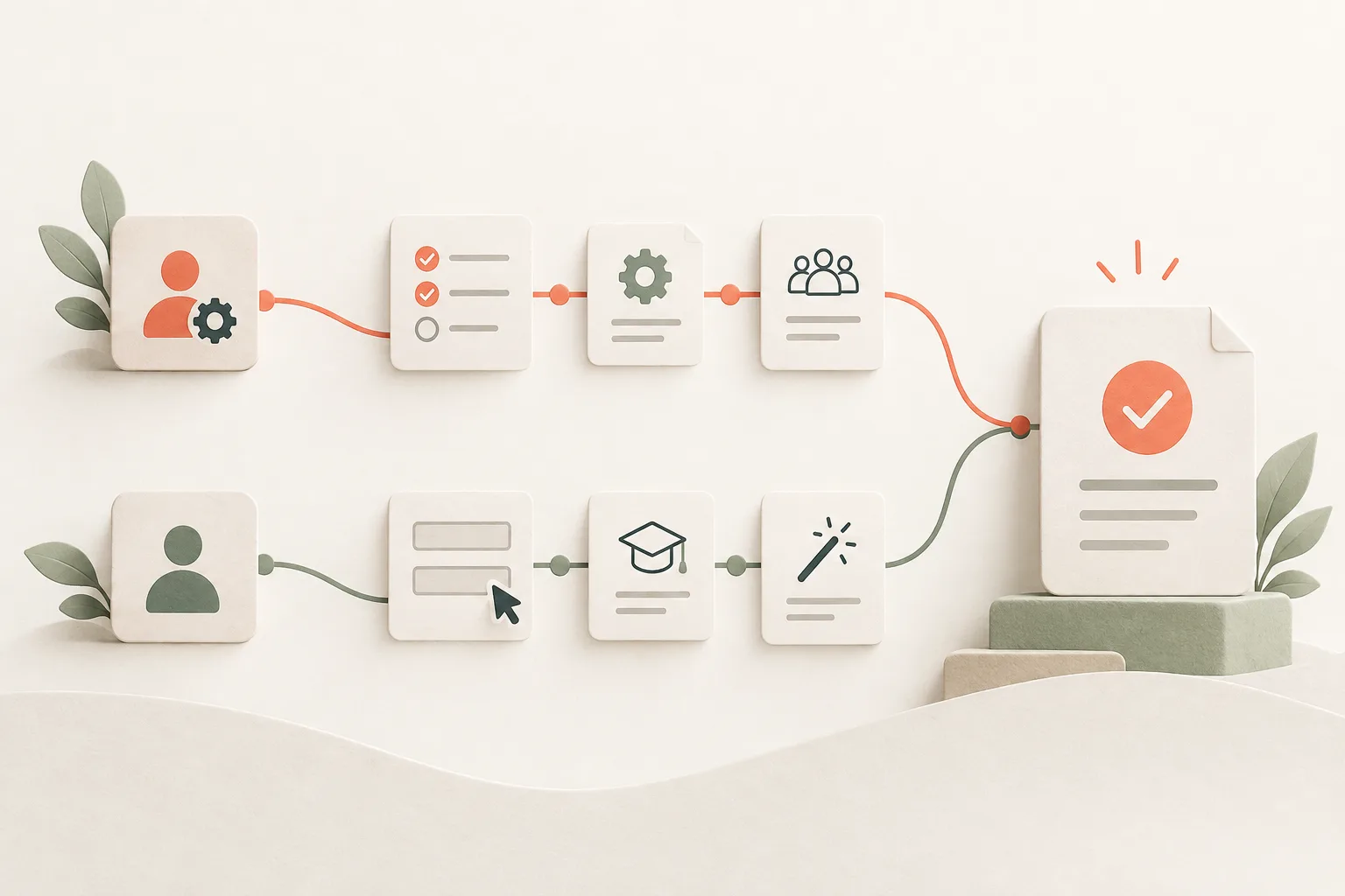
These are decisions to make, not prompts to show in sequence. One screen does not need every pattern at once.
- 1↓
Name the difficulty
Is it a rule, a sequence of actions, or work to return to later?
- 2↓
Check the screen
A clearer label or a missing status may be enough.
- 3↓
Choose the help
Explain a rule, guide a connected task, or keep a checklist through pauses.
- 4
Let someone do the task
Check the import result and remaining questions, not just instruction completion.
Start by removing help that adds nothing
“Click Import to import your contacts.” It is an easy tooltip to write, approve, and put beside a button. It does little for the person using it. They have found the button. What worries them is what will happen to the contacts already in their database.
Consider a contact import in a B2B product. One person is afraid of overwriting records, another cannot work out the setup sequence, and a third is waiting for a colleague to send the file. Those people need different help. Choose between a tour, a checklist, and a tooltip once you know which difficulty you are dealing with.
A question about one field needs an explanation beside it
The form has a switch labelled “Update existing contacts.” It does not explain how the service finds a match or what it does with blank cells. Suppose our example import matches by email and preserves existing values when a cell is empty. Useful help would say: “We’ll update contacts with the same email address. Blank cells in your file won’t erase existing data.”
Now the person can understand what they are agreeing to.
That rule belongs beside the switch. If somebody needs it to make a safe decision, keep it visible in the form. An important condition does not have to sit inside a tooltip that they must notice and open first.
A full guide to preparing a CSV is a different matter. Put a sample file or instructions where people can use them before uploading. The space available gives you a useful boundary: one explanation fits by the control; the whole preparation process does not.
Use a tour when the person can do the task now
The file is ready, the person has permission, and they have opened the import tool for the first time. A short sequence can help: upload the CSV, match its columns, then check the preview. At each step they work with their own file and see what their choice changes.
This tour has a meaningful end. The person confirms the import, the service processes it, and the result is available to check. If some records failed, they need to understand the errors. A tick on the last tooltip will not resolve them.
It gets harder when the sequence keeps branching. One role lacks permission, another has a different file format, and somebody else already imported the data. Before putting a dozen conditions into the tour, see whether the form could explain its current step directly. Leave a way out too: people may want to work things out themselves or finish later.
A checklist helps when work has to stop and resume
Now imagine the same setup, except a colleague is still preparing the CSV. The user can configure fields, while an admin needs to grant access. A single uninterrupted tour does not fit this job. There are pauses and other people’s work between the actions.
A checklist can hold the plan through those pauses. Name its items after results: “Fields configured,” “File received,” “Contacts imported.” Someone can tick “Open settings” without setting anything up.
This is where the product needs to keep an accurate account of progress. Finished items should stay finished after sign-in. If a colleague completes the import, shared account status should reflect that. For a blocked step, show who needs to act and what they need to do.
The list does not have to become compulsory homework. If the person has already completed their job, optional items such as uploading an avatar should not imply that the product is still unready for use.
Compare the obstacle before comparing the formats
After looking at the screen, you should be able to put the decision into a sentence. Use this table to check whether you are asking a format to solve the wrong problem.
All three patterns may have a place in your product. At a particular step, start with the help that answers the question in front of the user. An import might need a visible explanation of record updates and a short tour of column matching. A checklist would serve people who are still waiting for preparation.
You can test that choice before a large rollout. Give someone a file and ask them to add the contacts while keeping the existing data they need. Listen to the question they ask. Can they continue once you explain it? That is the question your interface needs to answer.
| The obstacle | What to try | What it will not fix |
|---|---|---|
| A rule beside one field is unclear | Visible help or a tooltip | An error in the underlying rule |
| The order of available actions is unfamiliar | A short tour through one task | Missing data or permissions |
| Several jobs need to be resumed later | A checklist with saved progress | Waiting on a colleague with no clear owner |
| A button’s purpose is unclear | Rewrite its label | A broken or needlessly complex process behind the button |